Gage logo

A 0-to-1 design system for the fin-tech company reimagining the way money moves to empower every person’s potential.

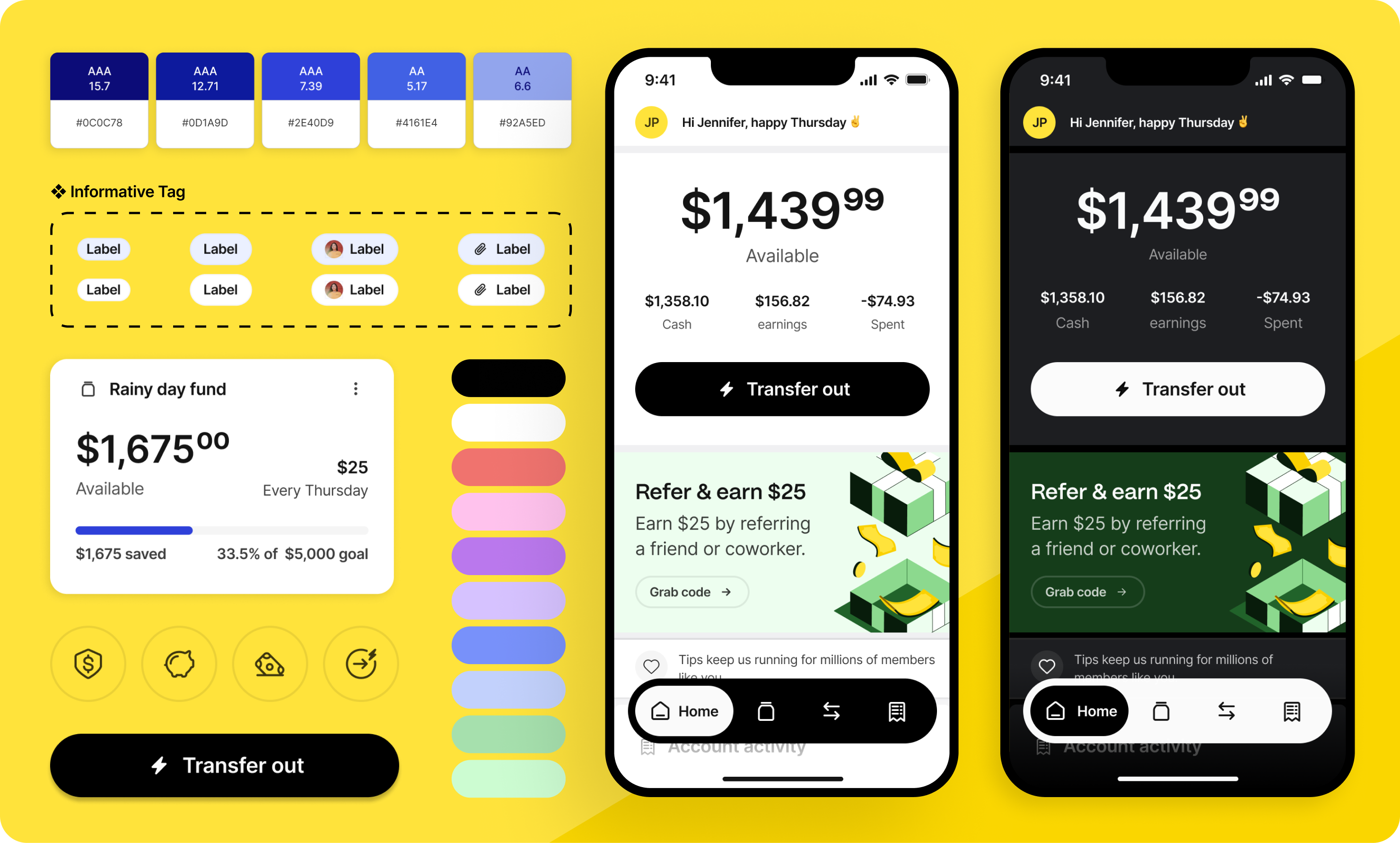
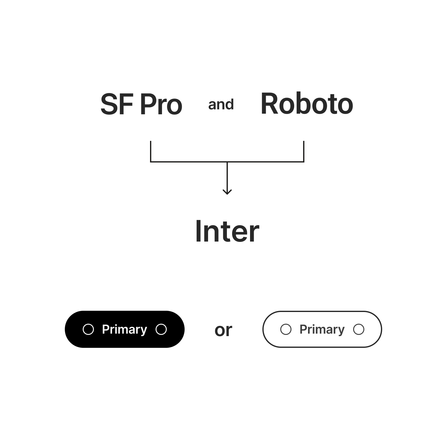
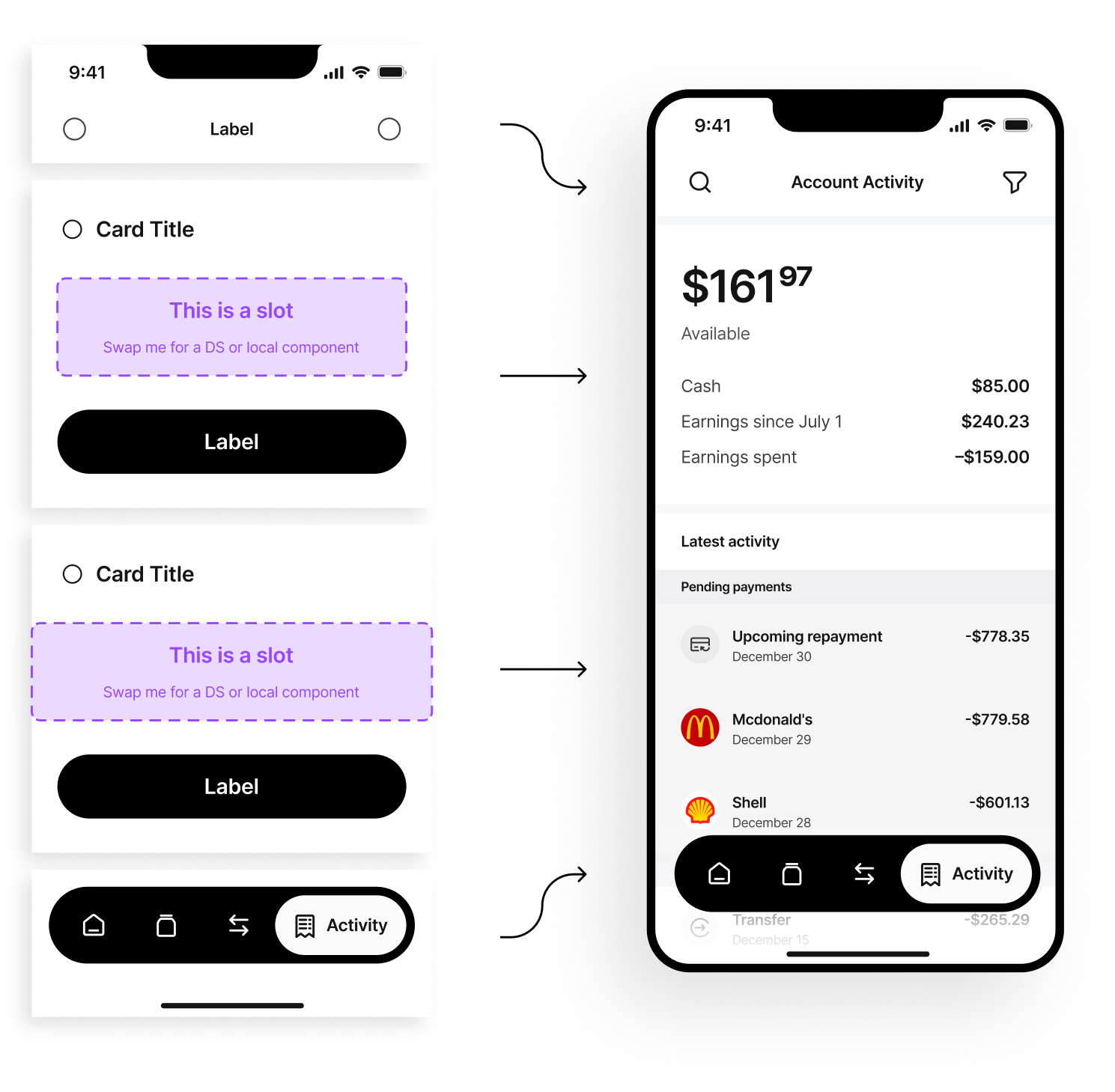
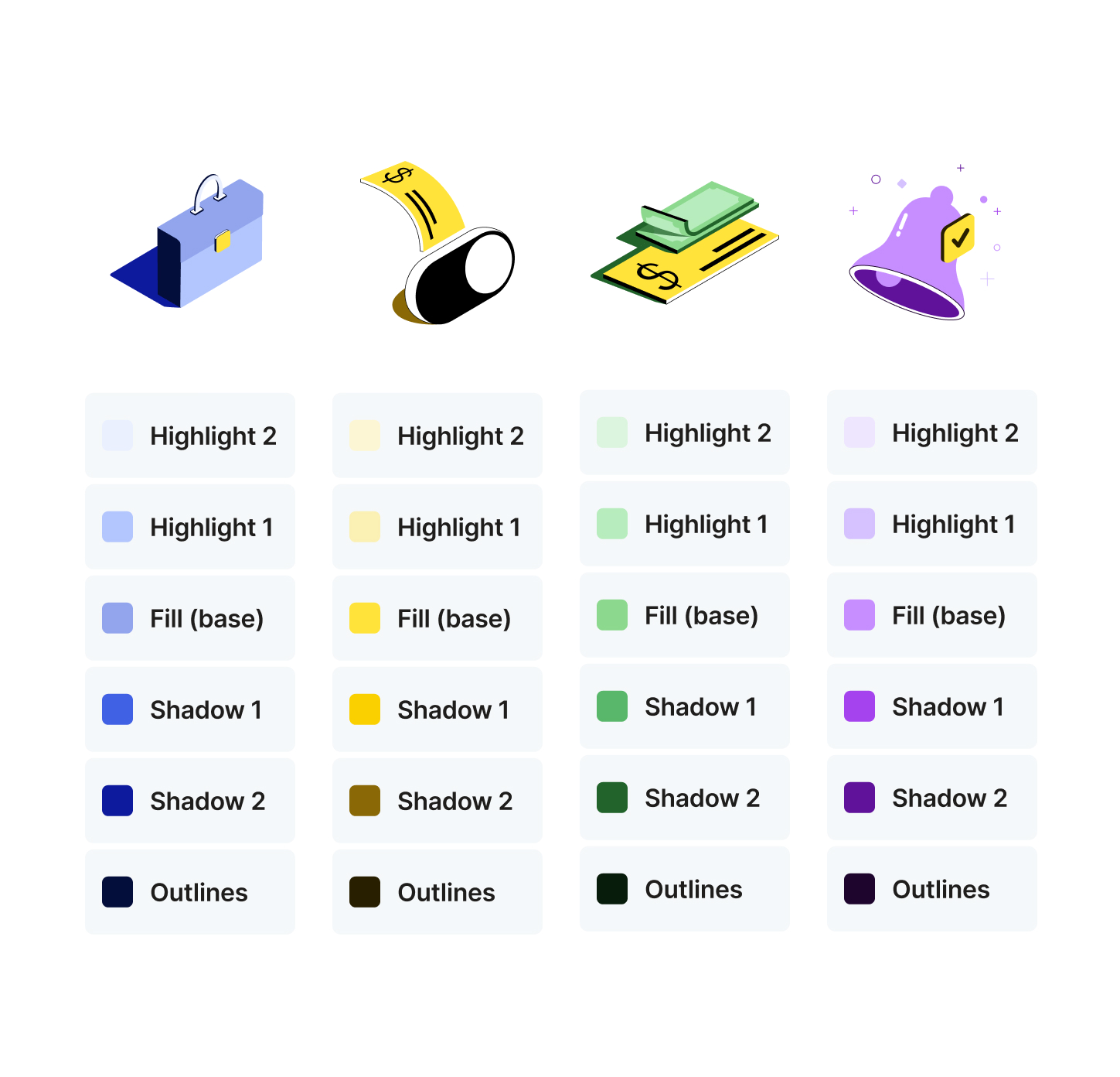
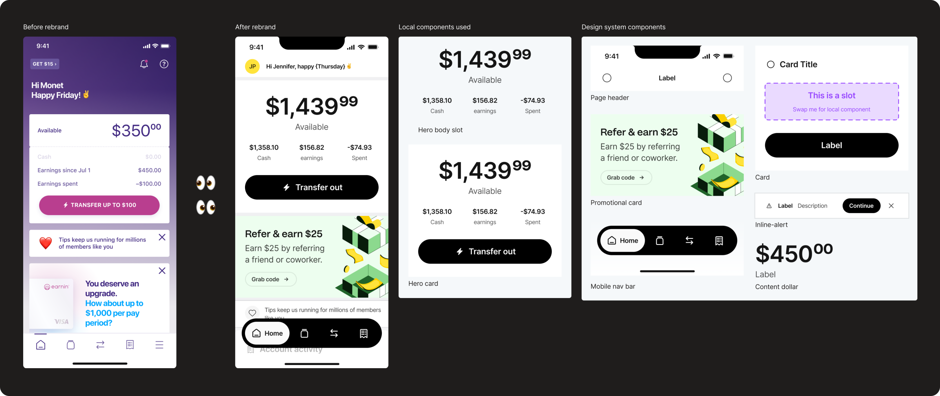
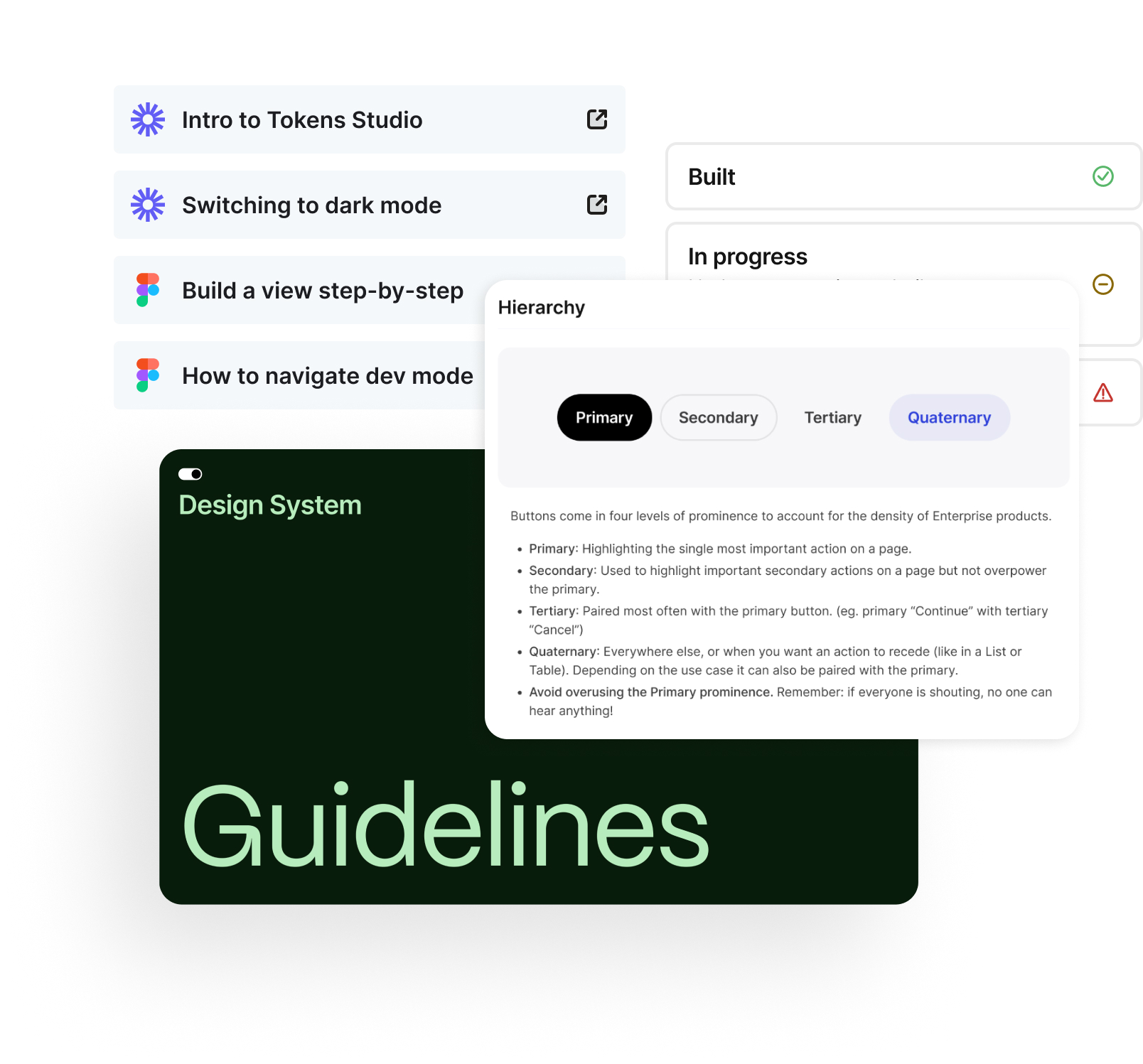
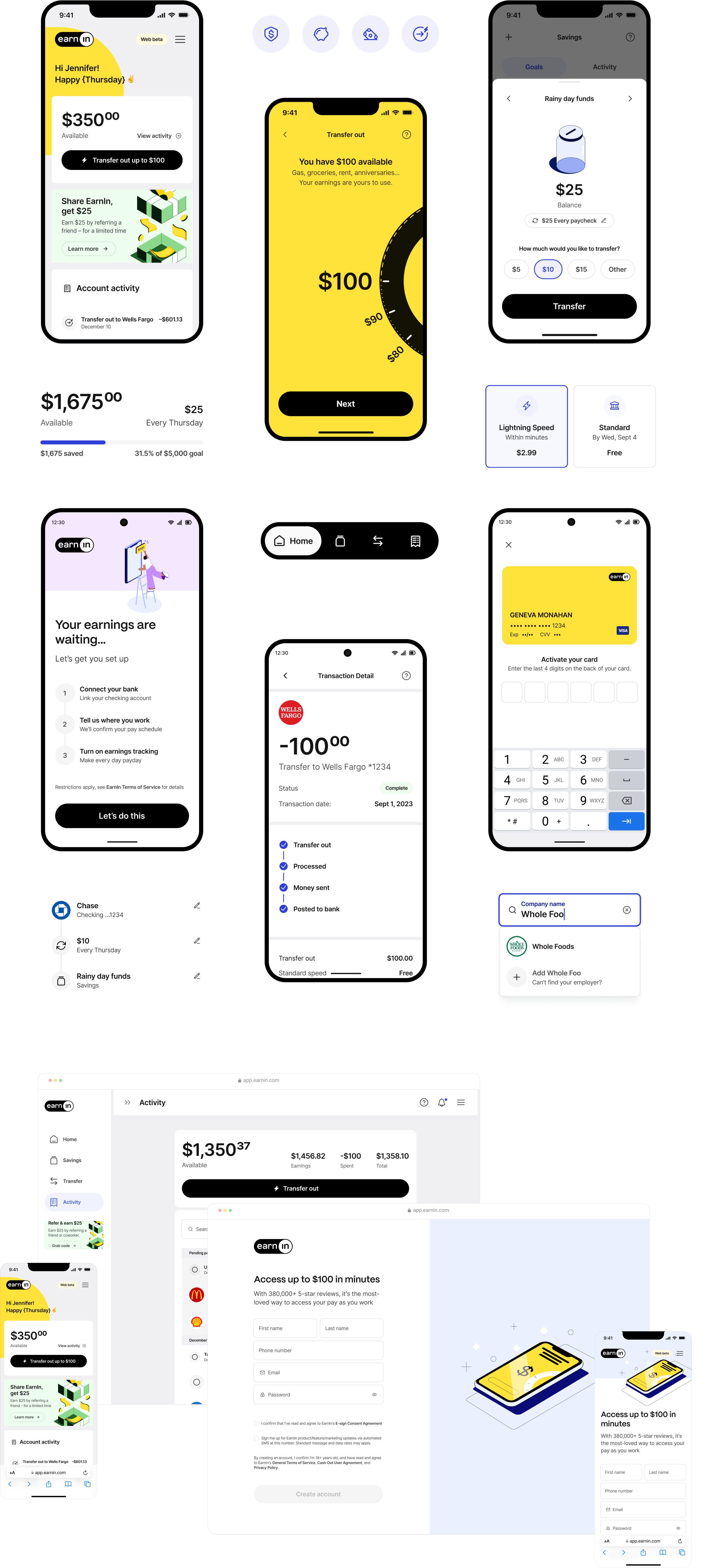
I led the creation of this platform-agnostic, multi-brand design system over the course of 6 months with support from two other team members.

Dashboard and mobile view of the home screens for gage.

🤔
So, we needed to create a platform-agnostic, multi-brand design system that reflected a new brand and could be adopted by early Figma users.

The EarnIn team had recently gone through a rebrand and knew it was the perfect opportunity to introduce a new design system in this season of growth.

One challenge was planning for the adoption of the design system for consumers who were early Figma users. Extra strategic energy went into making a complex system easy to use with more time spent on training and documentation.

I dive into my approaches for alignment to code, token architecture, and sub-systems here. For this project, I want to highlight some other specific areas.

Home screen of the mobile app that shows the data visuals for the gage score.

Discovery and early road blocks

The EarnIn design language before the rebrand was much more stylized. The rebrand warranted a more conservative and mature look that would better gain the trust of the fin-tech company’s audience. This presented many opportunities to consolidate styles and define new design decisions to prepare for token building.

Two of these opportunities were consolidating the system fonts previously being used into one font, the famous Inter. The other is the styling of the primary button, whether to go with a solid, more primary look or a bordered version that is traditionally more secondary. Both of these changes prompted hesitancy with leadership, but I presented mock-ups of how each would look and explained the impact of they would have on the system as a whole. This allowed a final decision to be made and keep the project moving forward.

2 mobile phone screens showing the UI for touchpoints.

Component strategy

Since the design team was new to Figma, we needed to simplify how to build design views using the design system to ensure adoption. I introduced a card strategy where the card always acts as the primary container for content. The card includes a header, body slot, and footer. The designers were responsible for building the body content as a local component using design system components and swapping it into the card. This also helped them properly group relevant content and establish a proper hierarchy. They were able to get the hang of this strategy, and I still use versions of this in other systems.

2 mobile phone screens showing the ui for evaluations.

Illustration system

There were a wide variety of illustrations in various color ways. We wanted it to be easy for new illustrations to be created by introducing semantic colors specifically for illustrations that point to a color primitive. This way an illustrator would know exactly which color to use for the base, shadows, highlights, and outlines. We could also define stroke weight and default sizes.

Dashboard and mobile view of the home screens for gage.

Training workshops

I led training workshops to teach designers and other FXN partners how to use the system. We would review their designs before the rebrand and compare them to views designed using the new design system. I would walk them through what design system components were utilized and what local components needed to be created.

Designers would then spend time recreating that view or practice designing views in their particular product area. For larger team workshops, we would break out into smaller groups to answer questions effectively.

This process was helpful for the team as they were also learning the appropriate names for each component as well as how to use local components to save complex overrides effectively.

2 mobile phone screens showing the ui for sending notices.

Documentation

Before project handoff, I created a wide variety of how-to videos along with other Figma resources so their team could feel confident in continuing to move the design system forward. I was able to document every component, which included what the component was used for, best user experience practices, states, component properties, and tips.

I was very proud of what their team accomplished upon completing our time on this project.

Dashboard and mobile view of the home screens for gage.

Interested in seeing more of the nitty-gritty?

If you’re a recruiter or hiring manager, email katiecooper@realtenacious.com or use the Calendly link below to schedule a more detailed walk-through of this and other design system projects.

Calendly link