Gage logo

A 0-to-1 design system for the internal tools that power the self driving car company.

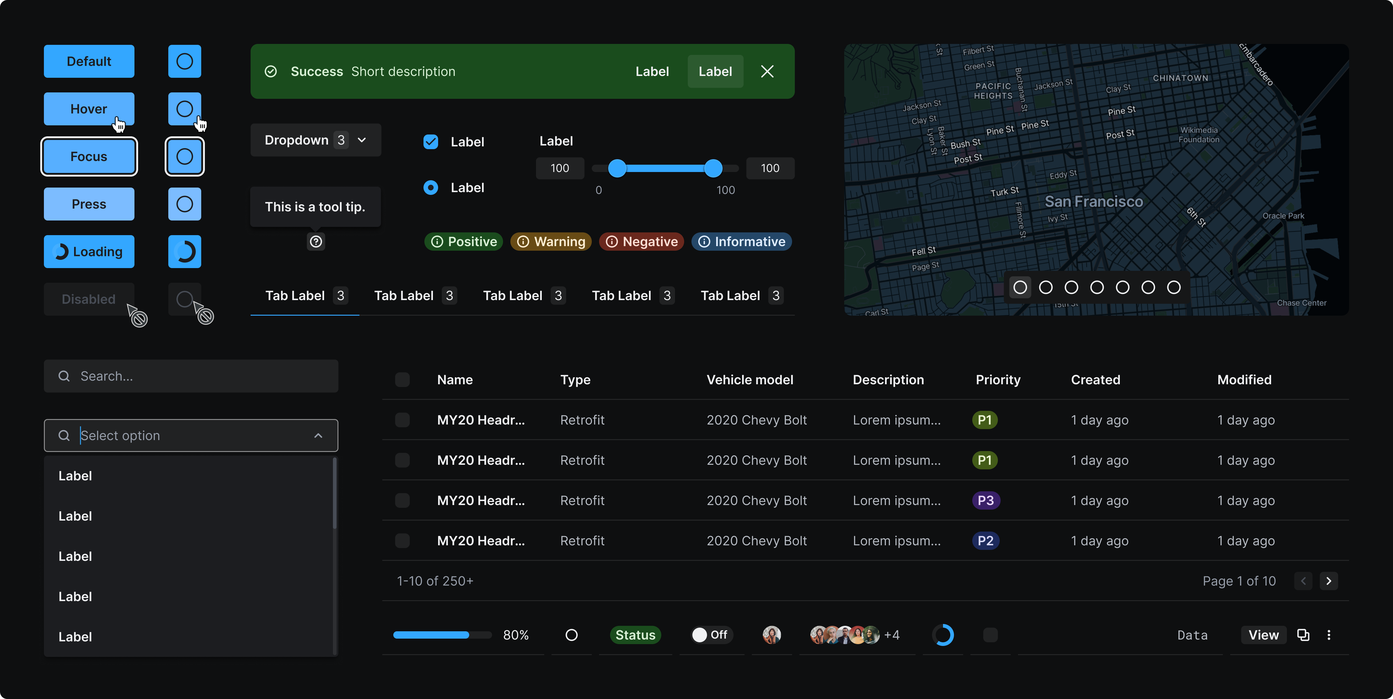
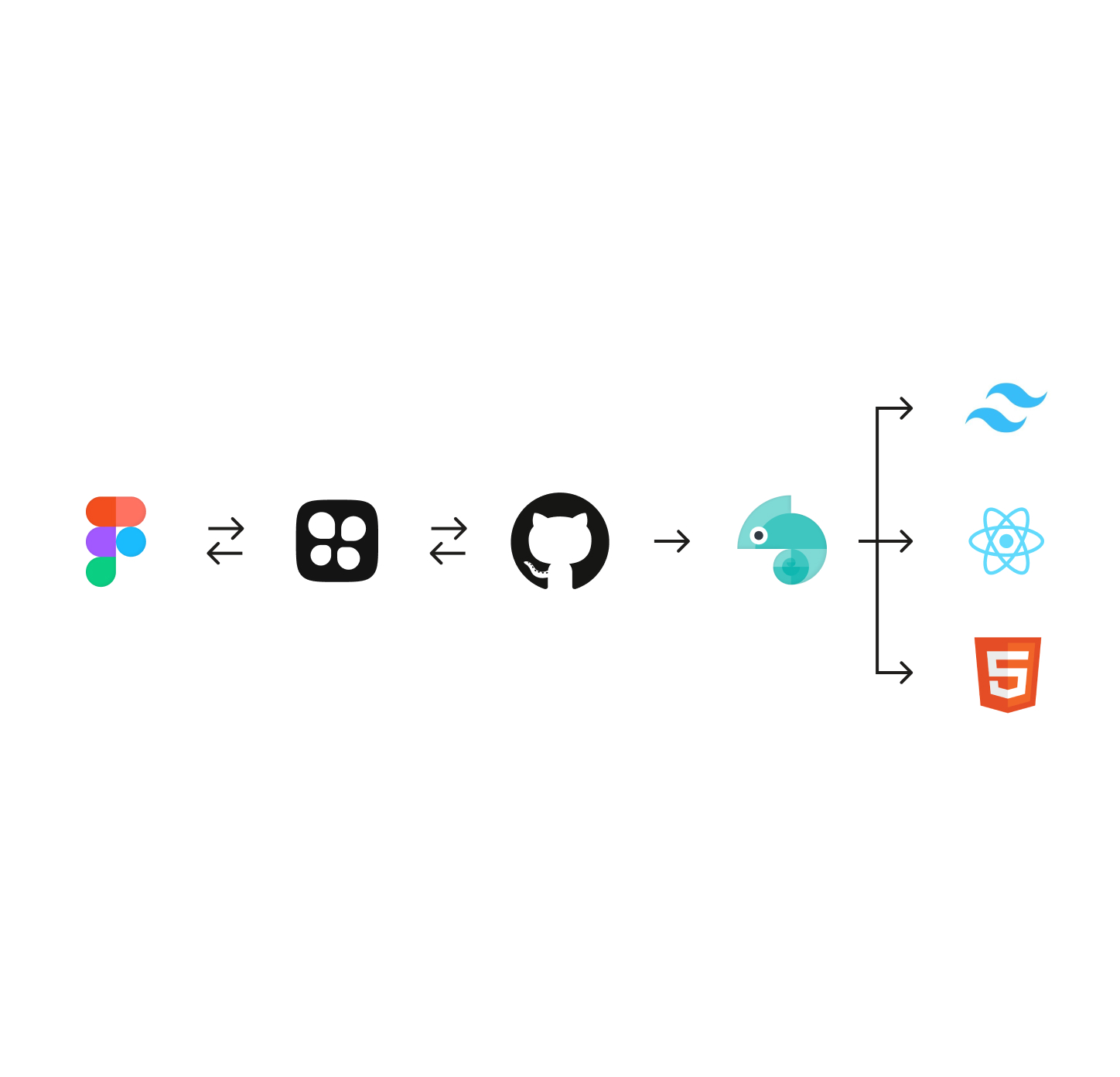
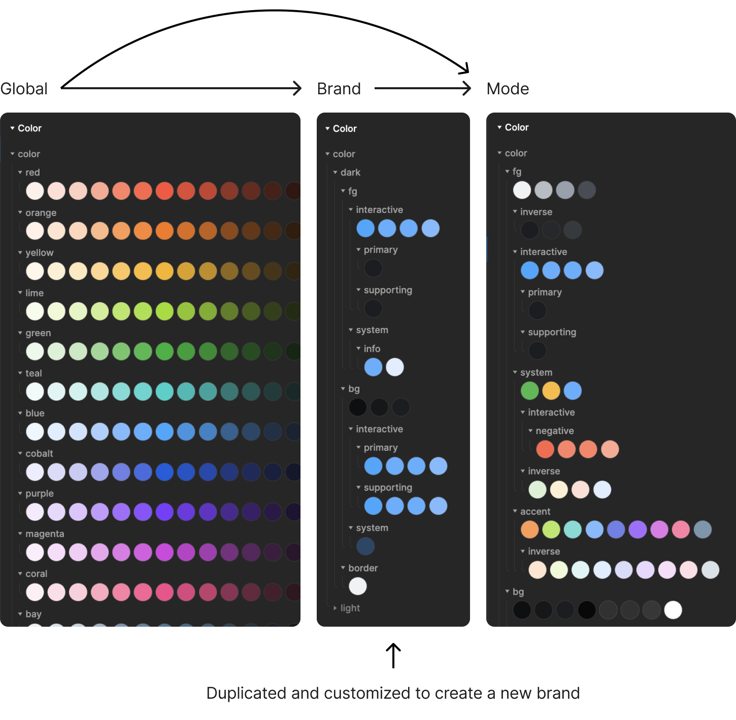
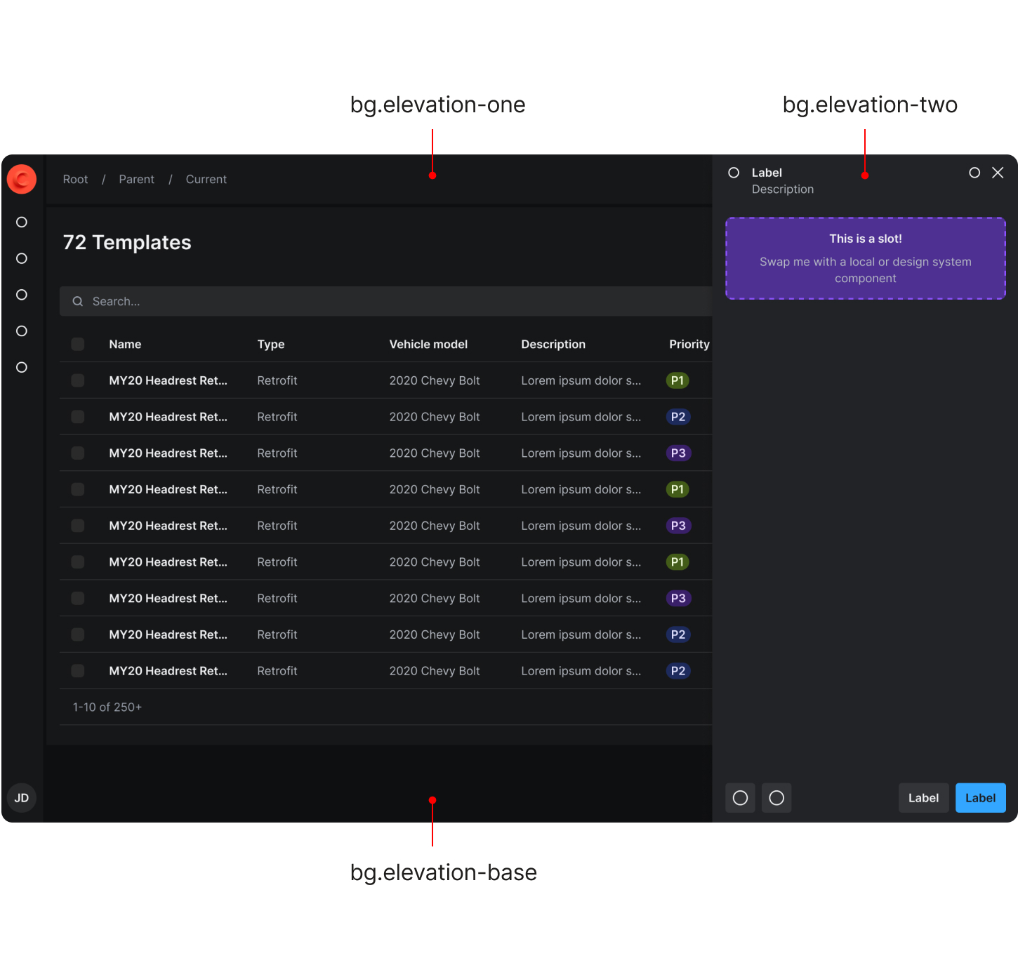
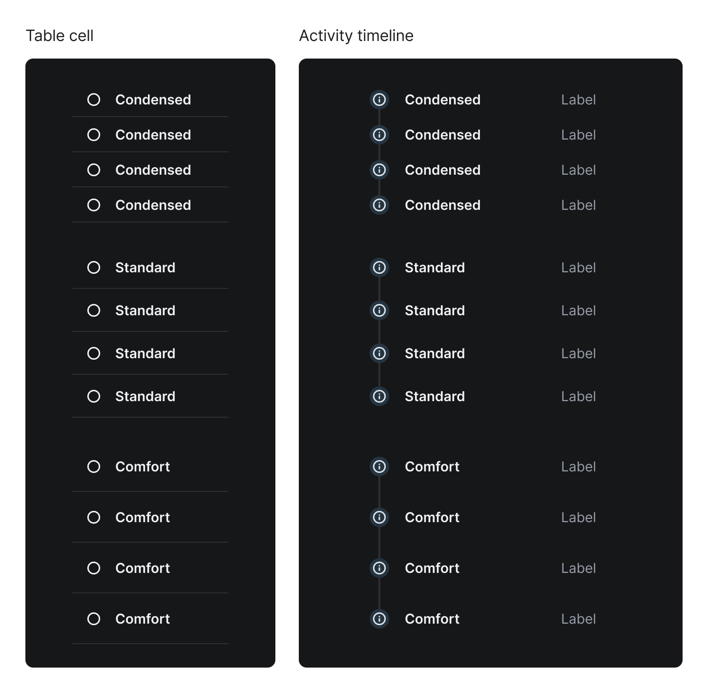
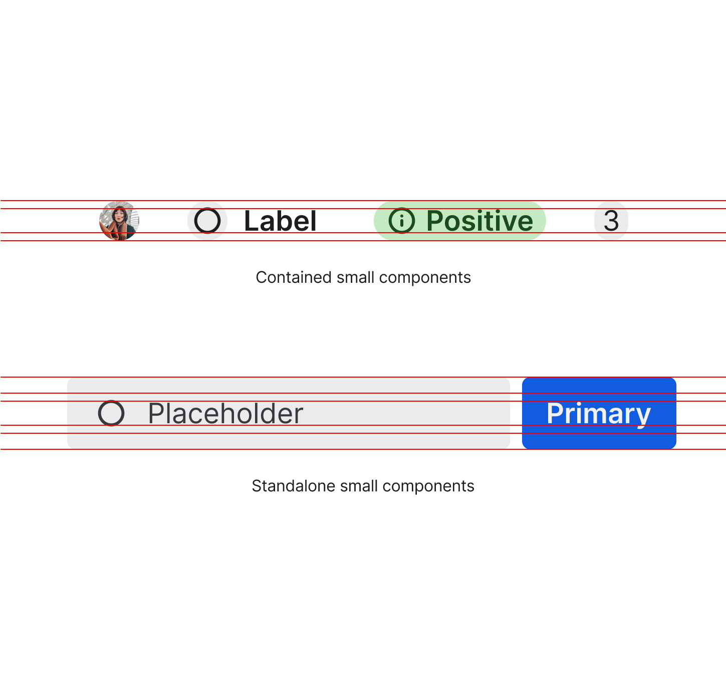
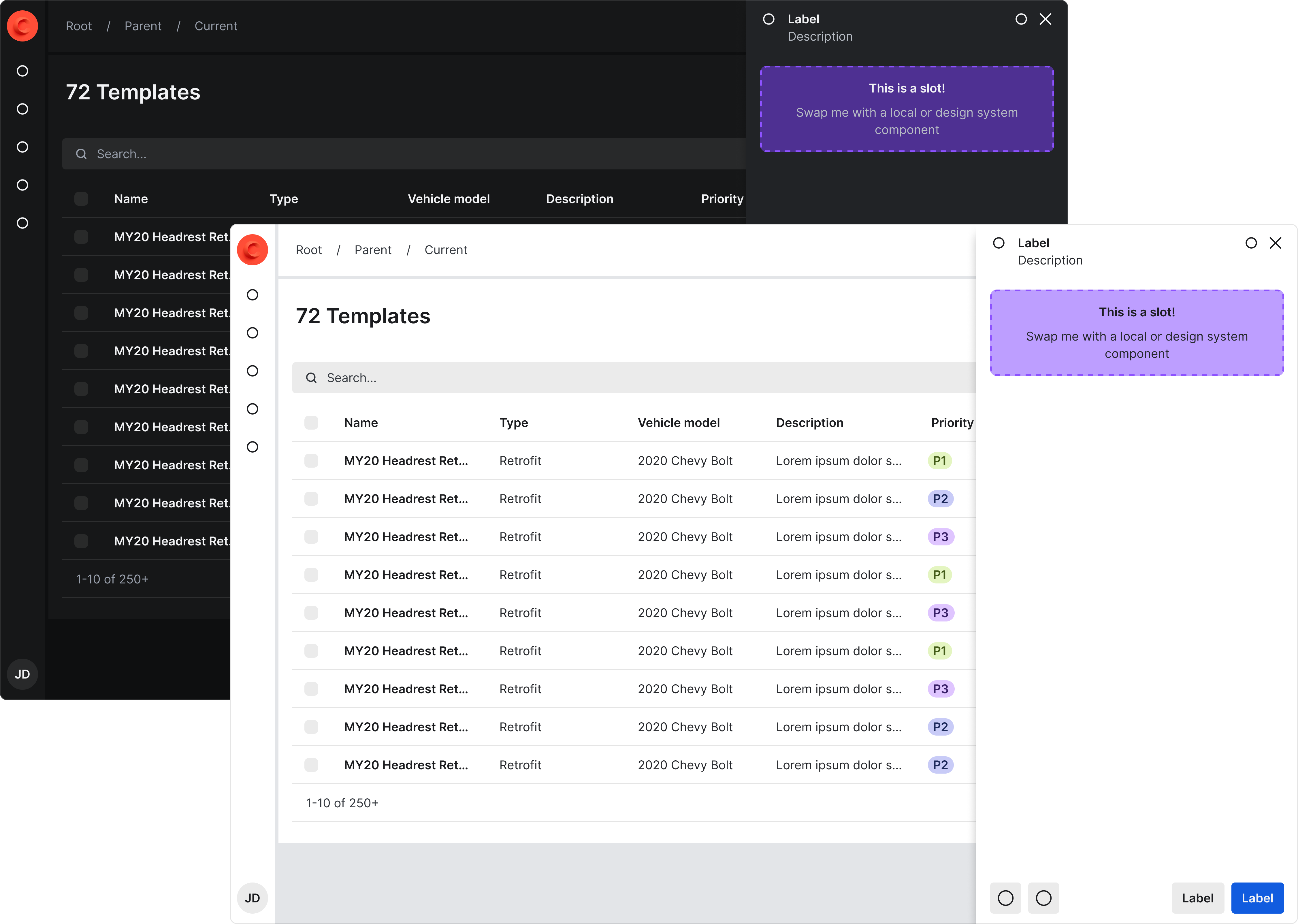
Through staff augmentation I joined the Cruise team for a 16 week period to lead the initiative of building a 0-to-1 design system for their 7+ internal products in collaboration with their in-house engineering team.

Dashboard and mobile view of the home screens for gage.

🤔
We needed to create consistency between all their internal products, combine new and existing token structures for pre-existing components, and prepare for their consumer product to adopt the design system.

The Cruise team was struggling with major inconsistencies throughout their products and was fully aware of their need for a design system. They needed support implementing best practices to allow for long-term scalability.

The highest priority was alignment with code and making sure any pre-existing components would not breaking upon implementation of the new design system.The internal tools team only offered dark mode and wanted the capability to add light mode.

Home screen of the mobile app that shows the data visuals for the gage score.

Aligning to code

Through the Figma plug-in Tokens Studio, we were able to push tokens directly to GitHub. They are then run through Style Dictionary so they can integrate with Tailwind CSS. It was critical that our global tokens matched Tailwind’s naming conventions for this to be successful.

Once applied to components I was able to review the visual application and code via Chromatic as well as Storybook before pushing updates to the product. This was a crucial step to ensure new token structures and implementation would not break any existing components.

2 mobile phone screens showing the UI for touchpoints.

Clarifying semantic tokens

The team had started trying to define their semantic  naming conventions but I noticed they were too vague to understand how they were being used, primarily when it came to color. After an audit and inventory of all their products I was able to consolidate and define color hierarchies and other styles. Additionally, to prepare for the consumer product using the system, I needed to create the addition of a supporting color to prevent the conflict of their primary brand color being red and negative states on input controls.

2 mobile phone screens showing the ui for evaluations.

Establishing elevation rules

There was lack of clarity and misuse around how background surface colors should be applied. I was able to simplify this by establishing the rules for elevation that mimic the layering of paper. The lowest level should always be the darkest color which is typically always the window/parent frame {bg.elevation-base}. The next layer is where the majority of the UI sits {bg.elevation-one}. The highest layer should only be used for popover elements such as tool tips and sheets {bg.elevation-two}. This prevents designers from incorrectly using a background color to segment content resulting in unnecessary UI chrome.

2 mobile phone screens showing the ui for sending notices.

Density options

The internal tools teams are often dealing with large amounts of dense data while the consumer product allows for much more breathing room. To solve for this we created three y-axis density tokens—condensed, standard, and comfort that are applied to most container components. The x-axis spacing tokens operate independently to maintain proper alignment throughout differently sized components.

2 mobile phone screens showing the ui for sending notices.

Sizing system

The sizing of components—excluding container components—was calculated by a variety of considerations: type scale, alignment to a 4px grid, and button heights. The ultimate goal is to create proper alignment of typography and buttons with other supporting components such as inputs, icons, avatars, tags, etc.

  • Icon instances align with font size.
  • Contained items or items that get nested align with line height. This allows for a background color where content doesn’t touch the edge of the frame.
  • Standalone components that can live independently such as inputs, buttons, icon buttons, etc. contain these nested items. Their heights match via y-axis padding.

Ultimately, typography and components of the same t-shirt size align perfectly. Multiple sizes can still be used to establish hierarchy.

Dashboard and mobile view of the home screens for gage.

Interested in seeing more of the nitty-gritty?

If you’re a recruiter or hiring manager, email katiecooper@realtenacious.com or use the Calendly link below to schedule a more detailed walk-through of this and other design system projects.

Calendly link